Overview
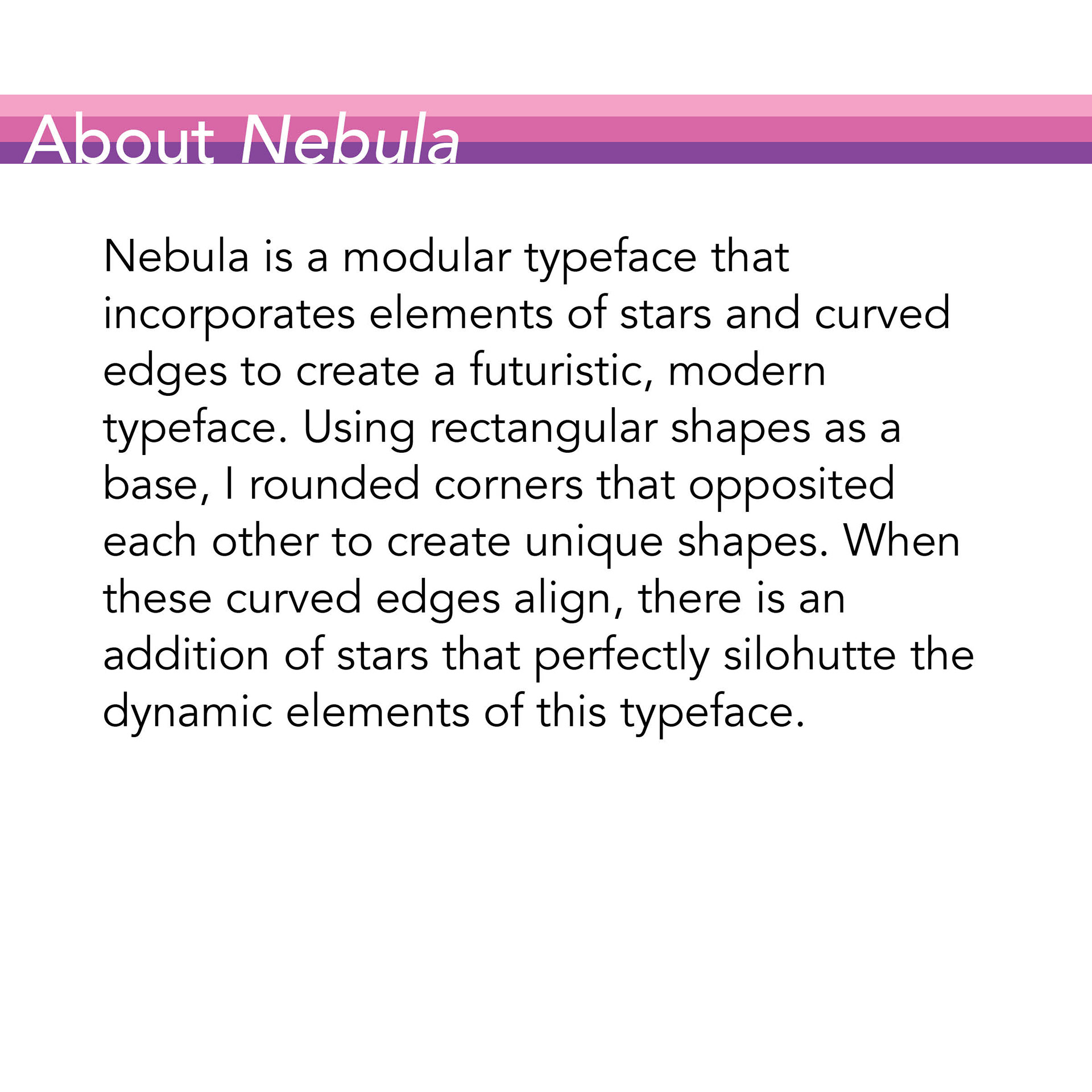
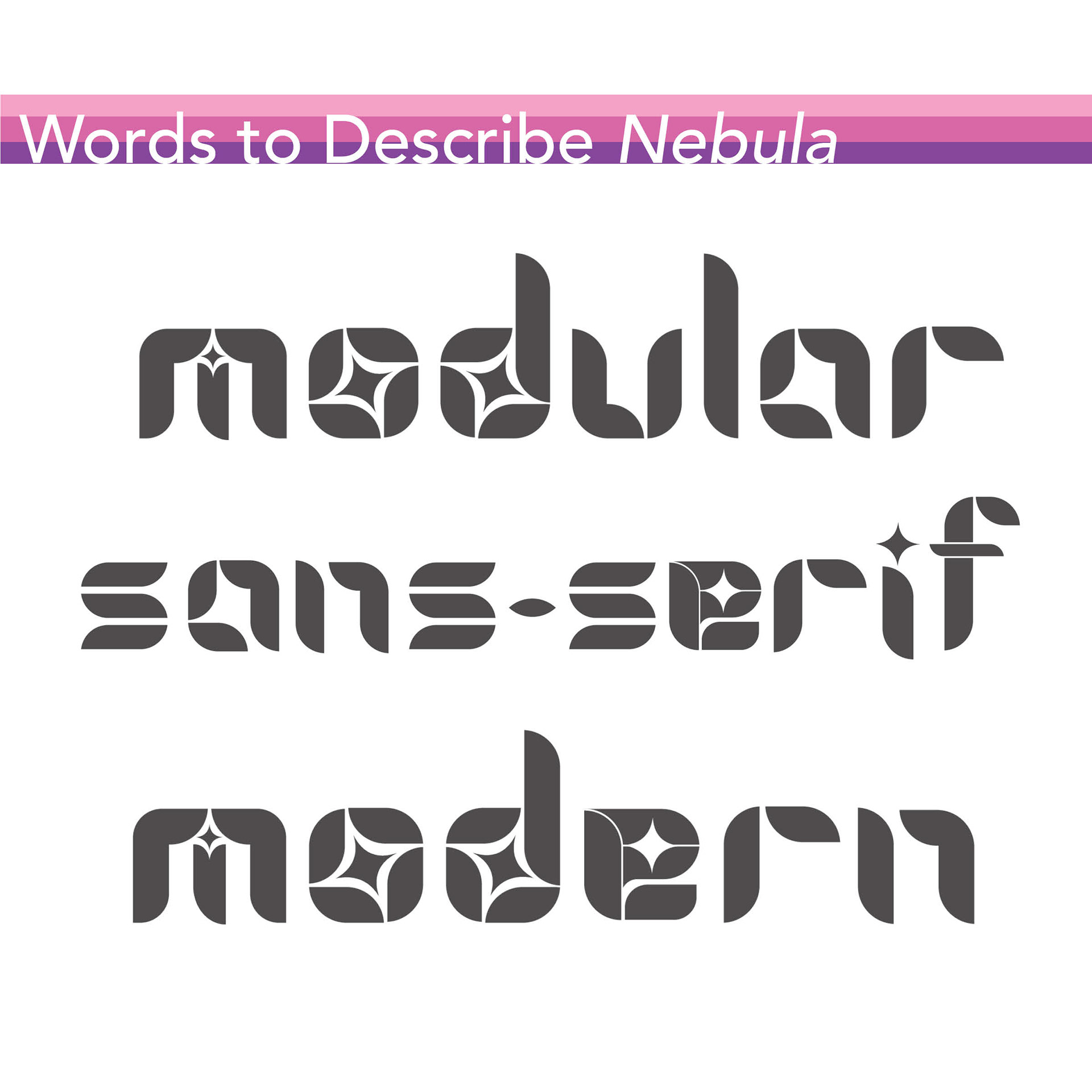
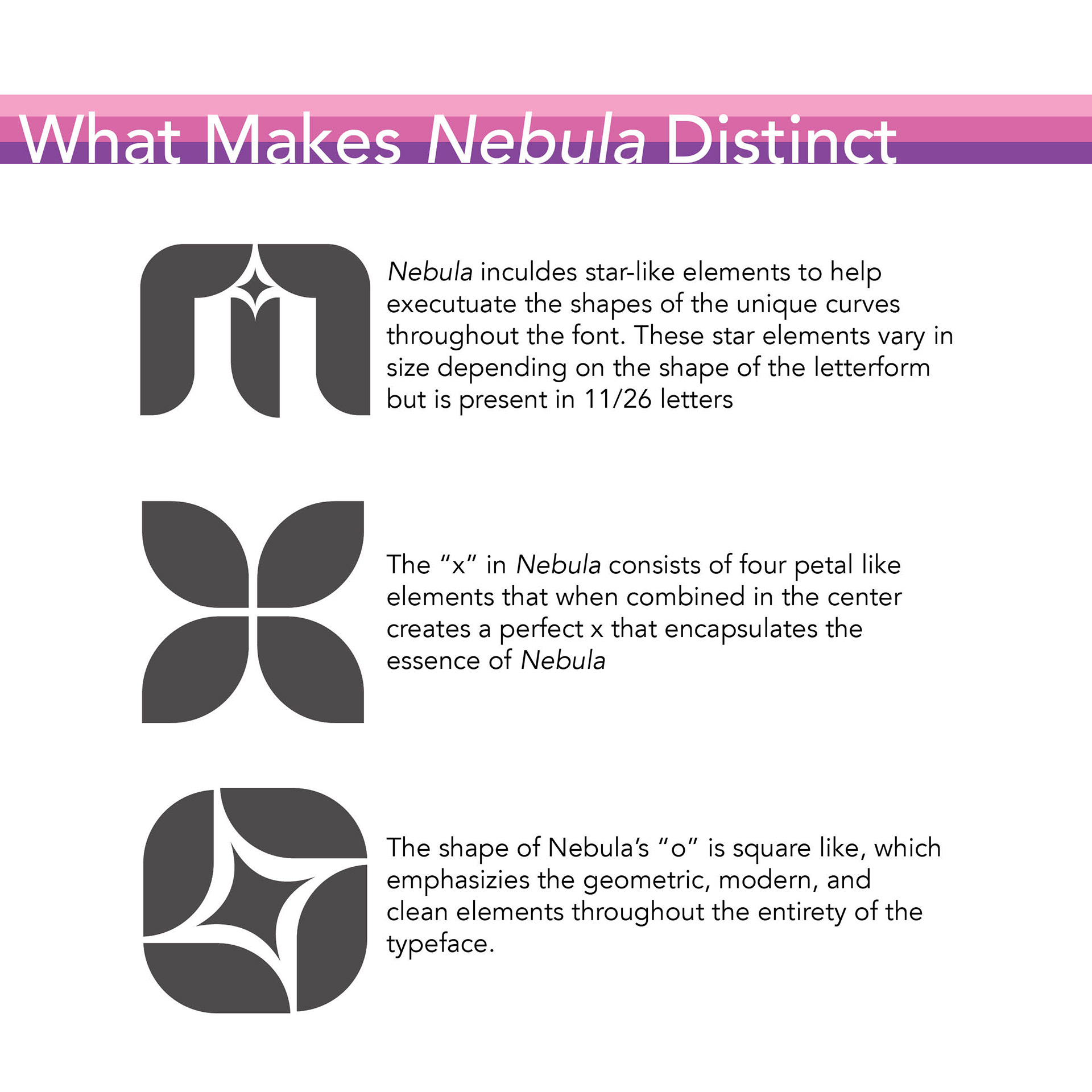
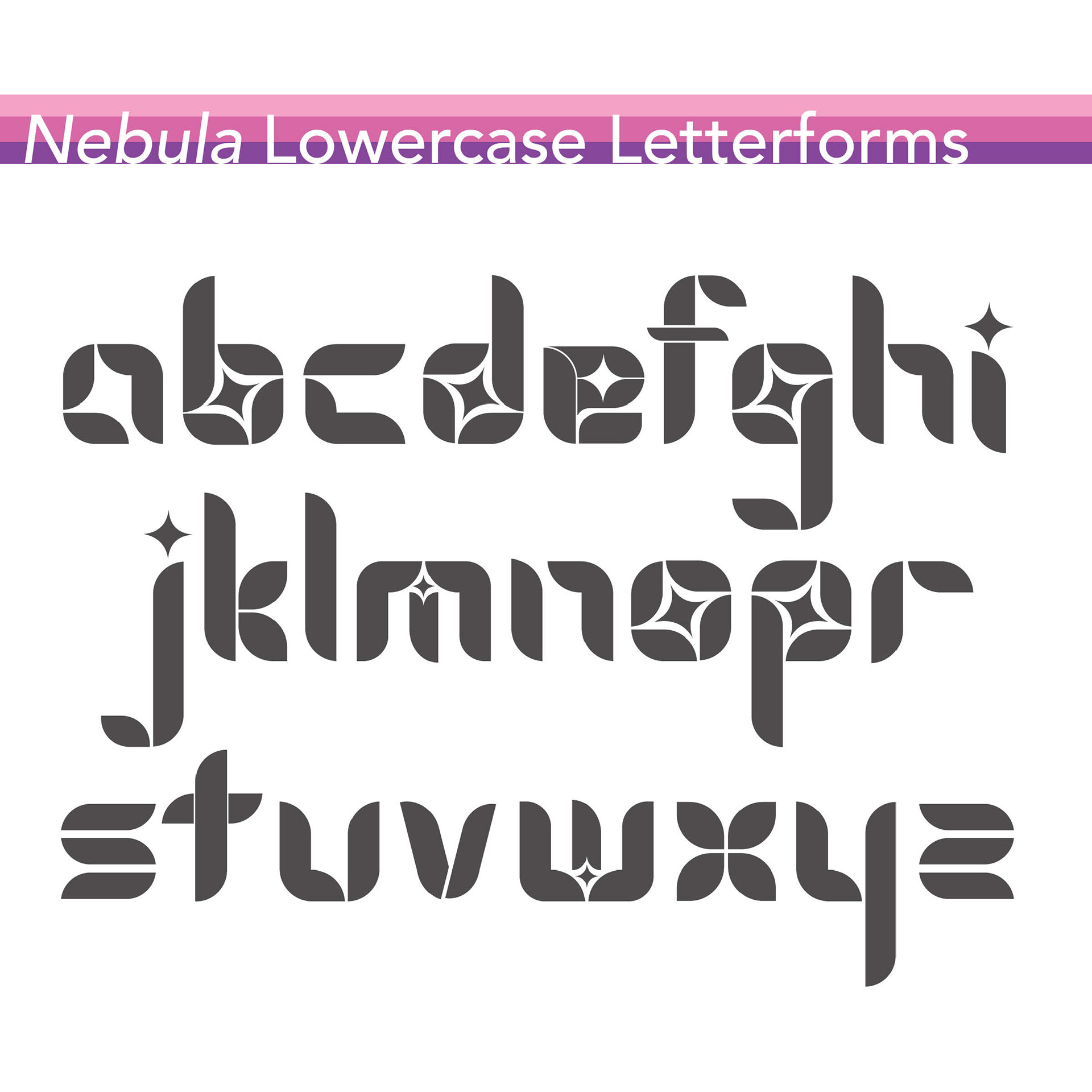
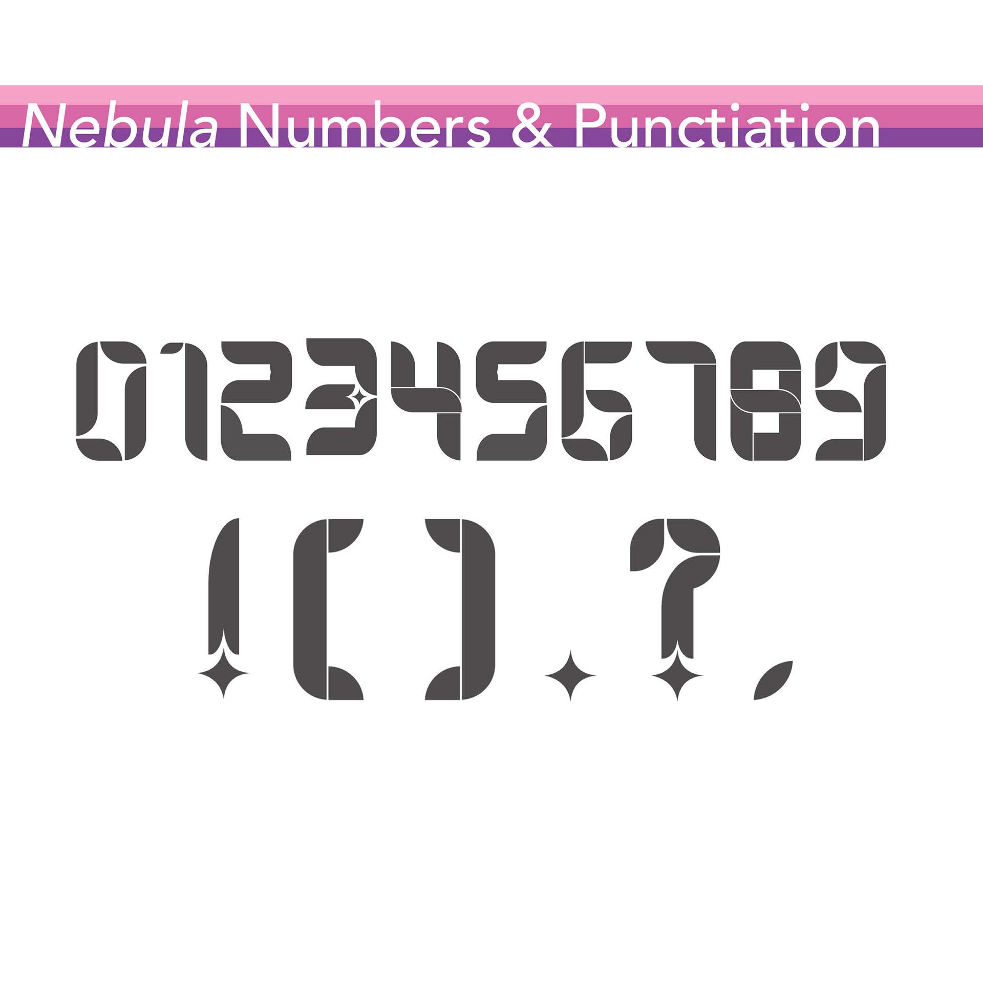
Nebula is a modular sans-serif typeface I designed that incorporates rounded edges and 4-pointed star shapes together to create a unique, dynamic set of letterforms.
Challenge
To design an original modular typeface, utilizing creativity and a grid system to achieve an evenly designed and well-organized collection of letters and numbers.
Approach
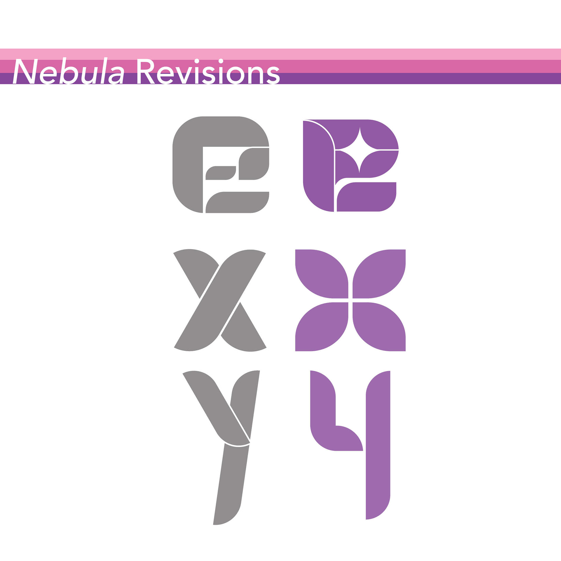
Nebula was originally designed using rectangular shapes on a 3 x 5 modular grid system. I first experimented with unique, interesting ways to display letterforms and gained a deeper understanding of the optimal and vital elements of the letterforms, such as line, stroke, shape, and height. Once I felt that the shapes I had created best represented all of the letters, symbols, and numbers that I desired to create, I then played around with them to create a collection that encapsulated the necessary with the interesting. Some elements, such as the rounded edges, separation of line and shape, and introducing stars to the counter of some letterforms. As I introduced these elements to the typeface, I ensured that all other forms best matched to create an overall cohesive design.
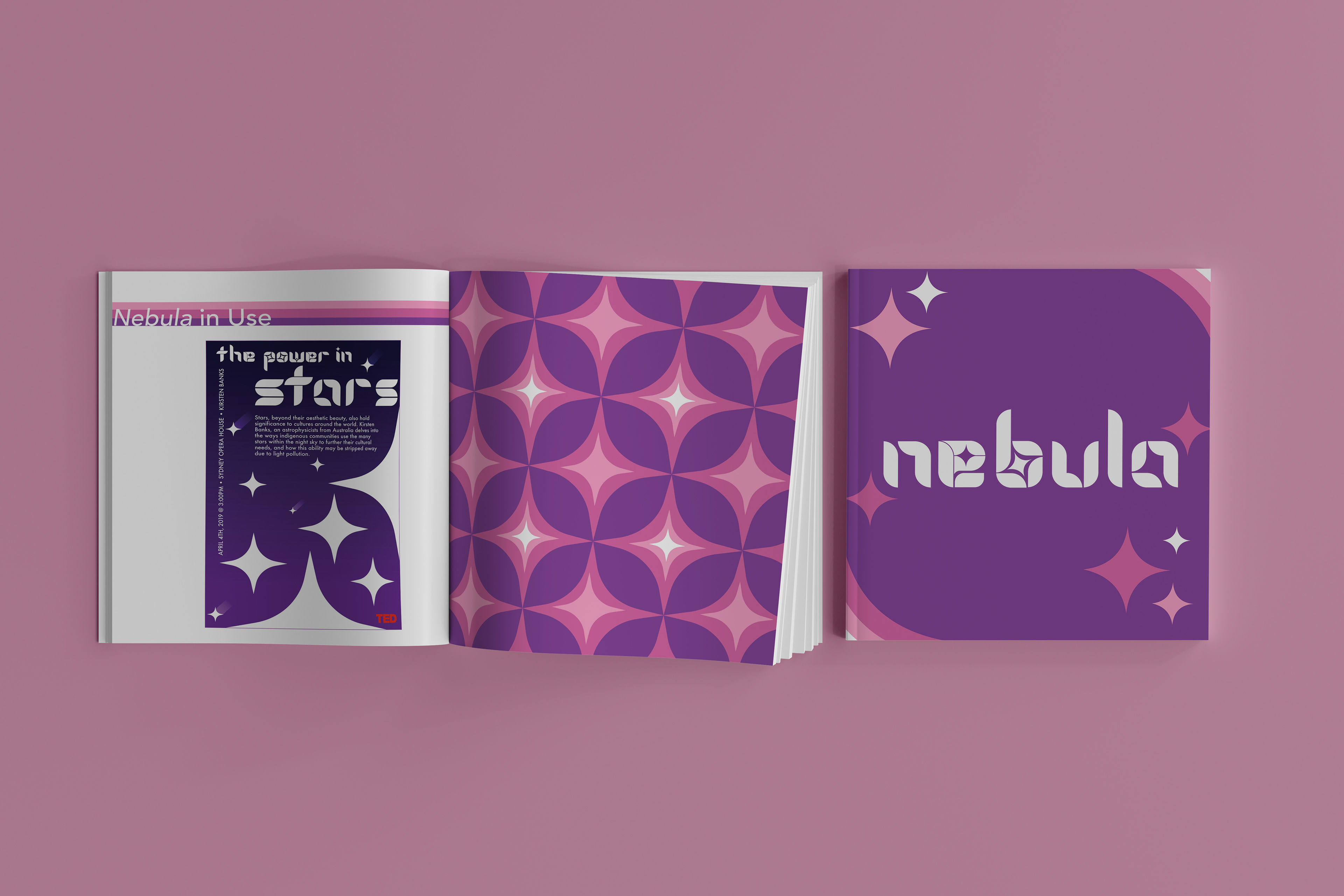
Once I created the complete set of lowercase letterforms, numbers, and punctuation, I designed a process book to detail my design efforts and explain its potential use scenarios. For the design of this process book, I decided to utilize a purple, pink, and white color palette, with dark gray type. I feel that this color palette help incorporate the space-inspired elements found within the letterforms while also giving the process book a clean, modern layout, which also ties into the overall design of the typeface. Throughout the book, motifs that I continually utilized include rounded edges, star patterns, and straight lines. I felt that these elements were vital to include throughout as they tie together the white space with the overall design, creating a sense of cohesion throughout and allows for the dynamic elements of the typeface to shine. In the process book, I detailed what Nebula is, some words that could be used to describe this typeface, how some letterforms changed throughout the creative process, how Nebula is different from other typefaces of its kind, all of the letterforms and symbols I created for it, as well as a real-world example of its possible use in poster design. I feel that these elements are important to include in a process book like this, as it details the creative process to someone interested in using the typeface, allows them to gain a better understanding of its potential use scenarios, and gives the typeface information and context on design decisions.


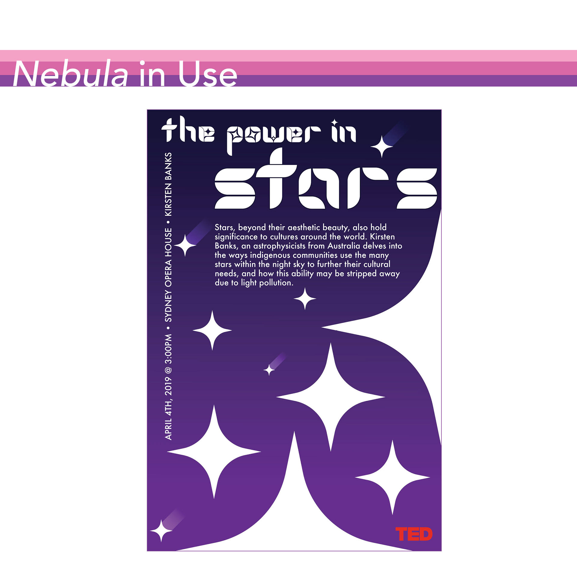


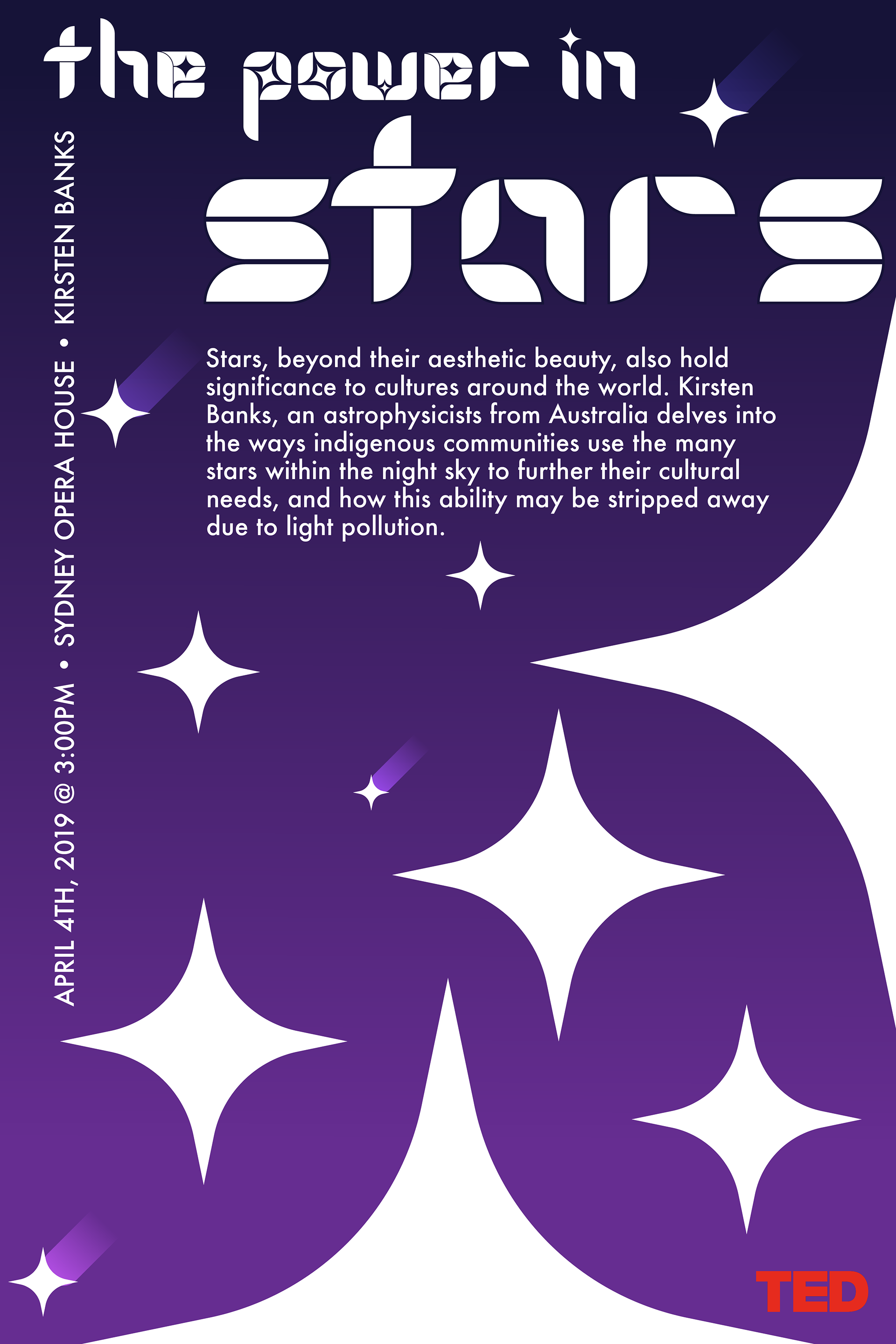
To display the unique elements in this typeface and its real-world use application, I created a TED Talk poster to illustrate its use as a decorative headline typeface. "The Power In Star" is a TED Talk presented by Kirsten Banks on April 4th, 2019. In this TED Talk, she discusses how vital stars are in Australia and beyond, specifically for cultural development and for their understanding of their environment. Their access to these necessary stars is being diminished due to the effects of pollution, specifically how light pollution and smog impact the visible radiance of stars. I felt that this TED Talk perfectly encapsulated the message of Nebula and fit its use in its poster design because the typeface displays unique ways in which rounded and straight edges can come together to create dynamic shapes. The combination of corners, rounded edges, and straight lines creates letterforms not typically seen, just as Banks discusses ways stars hold significance within Australian culture that are not initially seen by the naked eye. Once discovered and understood, they create a deeper appreciation for scientific and astronomical advancements.
Outcome
As a result of my effort and organization, I successfully created a typeface including lowercase letters, numbers, and some punctuation. In addition, the typebook highlights key characteristics for those interested in using and learning more about Nebula. This project taught me more about the construction of letterforms and how to utilize consistent elements to make a cohesive series.